Recent GNOME design work – Form and Function
The GNOME 46 development cycle started around October last year, and it has been a busy one for my GNOME user experience design work (as they all are). I wanted to share some details of what I’ve been working on, both to provide some insight into what I get up to day to day, and because some of the design work might be interesting to the wider community. This is by no means everything that I’ve been involved with, but rather covers the bigger chunks of work that I’ve spent time on.
Videos
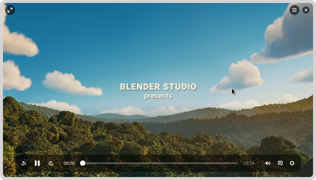
GNOME’s video player has yet to port to GTK 4, and it’s been a long time since it’s received major UX attention. This development cycle I worked on a set of designs for what a refreshed default GNOME video player might look like. These built on previous work from Tobias Bernard and myself.
The new Videos designs don’t have a particular development effort in mind, and are instead intended to provide inspiration and guidance for anyone who might want to work on modernising GNOME’s video playback experience.
The designs themselves aim to be clean and unobtrusive, while retaining the essential features you need from a video player. There’s a familial resemblance to GNOME’s new image viewer and camera apps, particularly with regards to the minimal window chrome.
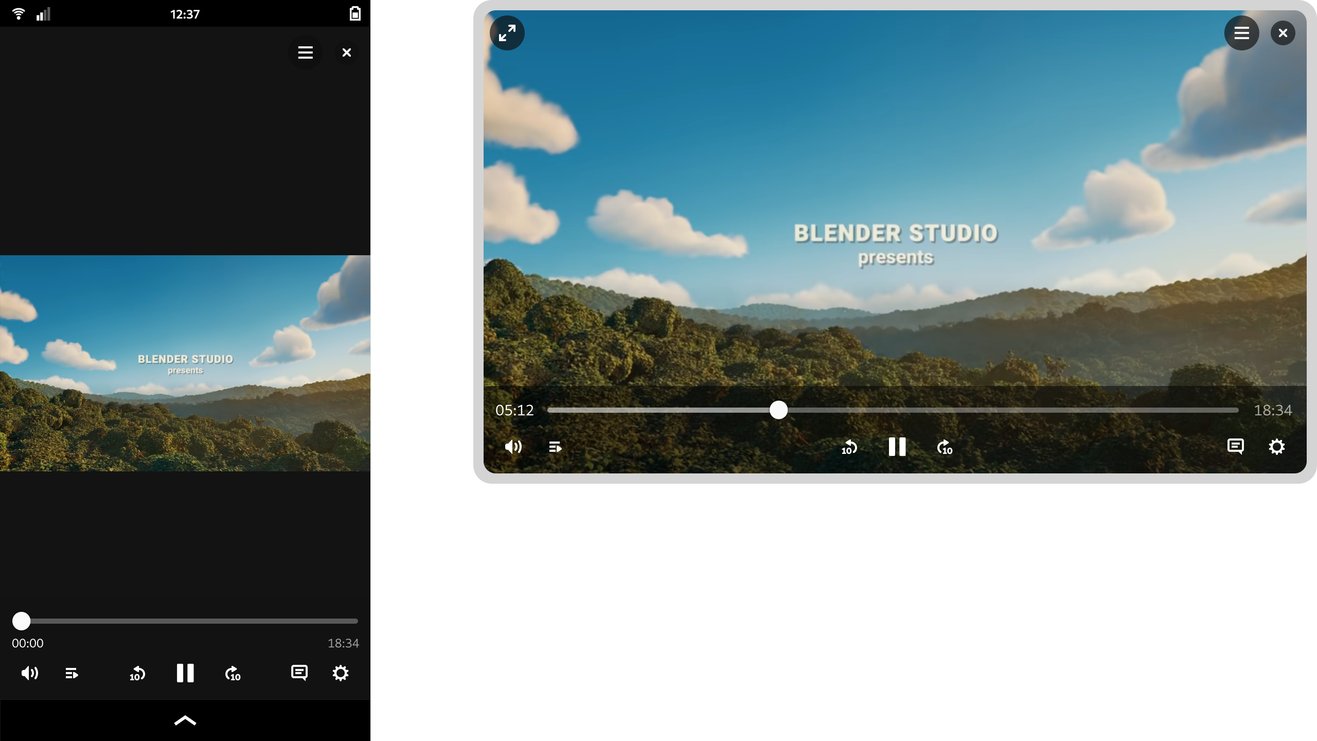
One feature of the design that I’m particularly happy with is how it manages to scale to different form factors. On a large display the playback controls are constrained, which avoids long pointer travel on super wide displays. When the window size is reduced, the layout updates to optimize for the smaller space. That this is possible is of course thanks to the amazing break points work in libadwaita last cycle.
These designs aren’t 100% complete and we’d need to talk through some issues as part of the development process, but they provide enough guidance for development work to begin.
System Monitor
Another app modernisation effort that I’ve been working on this cycle is for GNOME’s System Monitor app. This was recently ported to GTK 4, which meant that it was a good time to think about where to take the user experience next.
It’s true that there are other resource monitoring apps out there, like Usage, Mission Center, or Resources. However, I thought that it was important for the existing core app to have input from the design team. I also thought that it was important to put time into considering what a modern GNOME resource monitor might look like from a design perspective.
While the designs were created in conversation with the system monitor developers (thank you Robert and Harry!) and I’d love to take them forward in that context, the ideas in the mockups are free for anyone to use and it would be great if any of the other available apps wanted to pick them up.
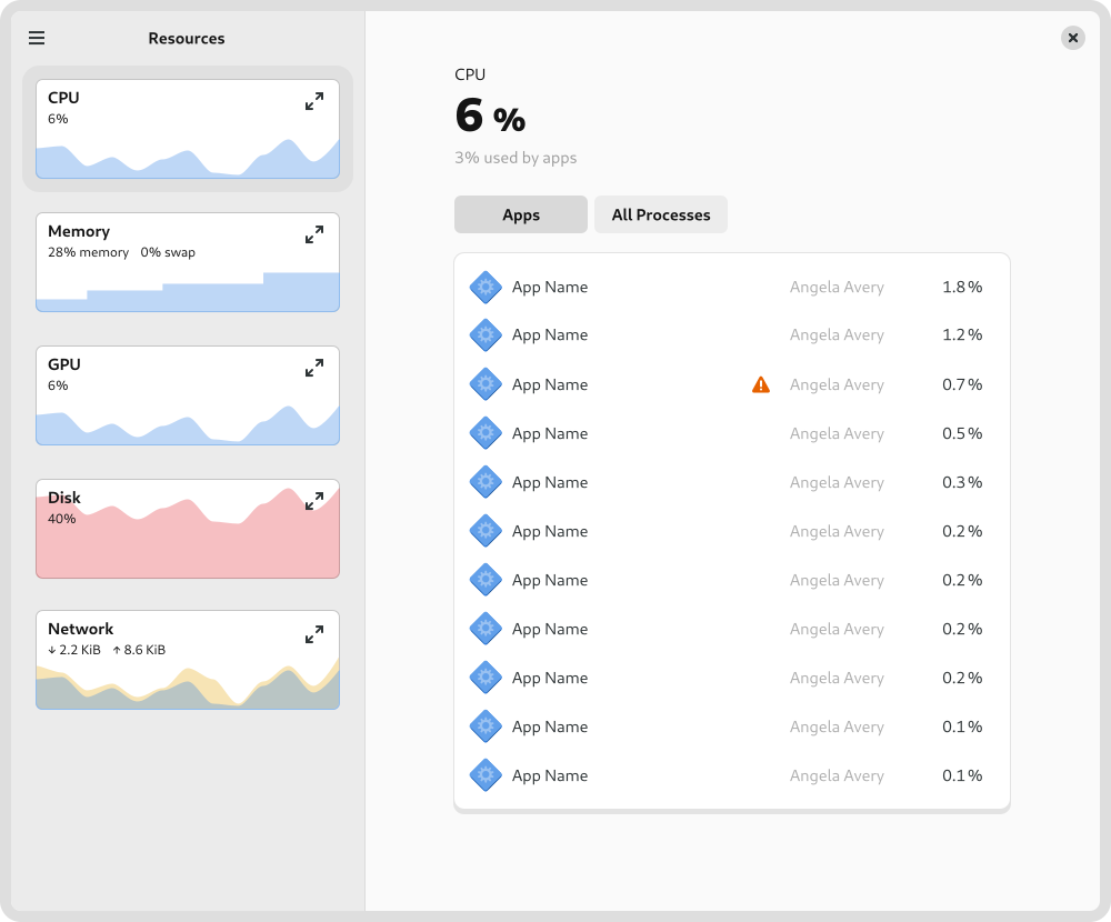
One of the tricky aspects of the system monitor design is how to accommodate different types of usage. Many users just need a simple way to track down and stop runaway apps and processes. At the same time, the system monitor can also be used by developers in very specific or nuanced ways, such as to look in close detail at a particular process, or to examine multithreading behaviour.
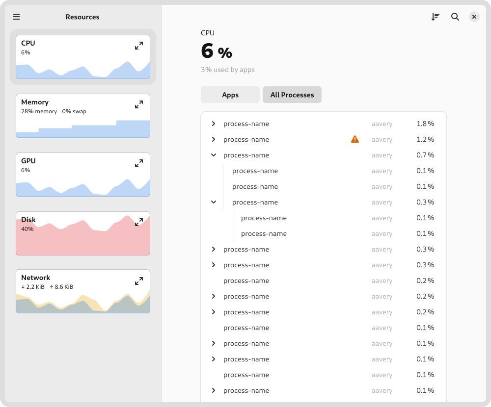
Rather than designing several different apps, the design attempts to reconcile these differing requirements by using disclosure. It starts of simply by default, with a series of small graphs give a high-level overview and allows quickly drilling down to a problem app. However, if you want more fine-grained information, it isn’t hard to get to. For example, to keep a close eye on a particular type of resource, you can expand its chart to get a big view with more detail, or to see how multi-threading is working in a particular process, you can switch to the process view.
Settings
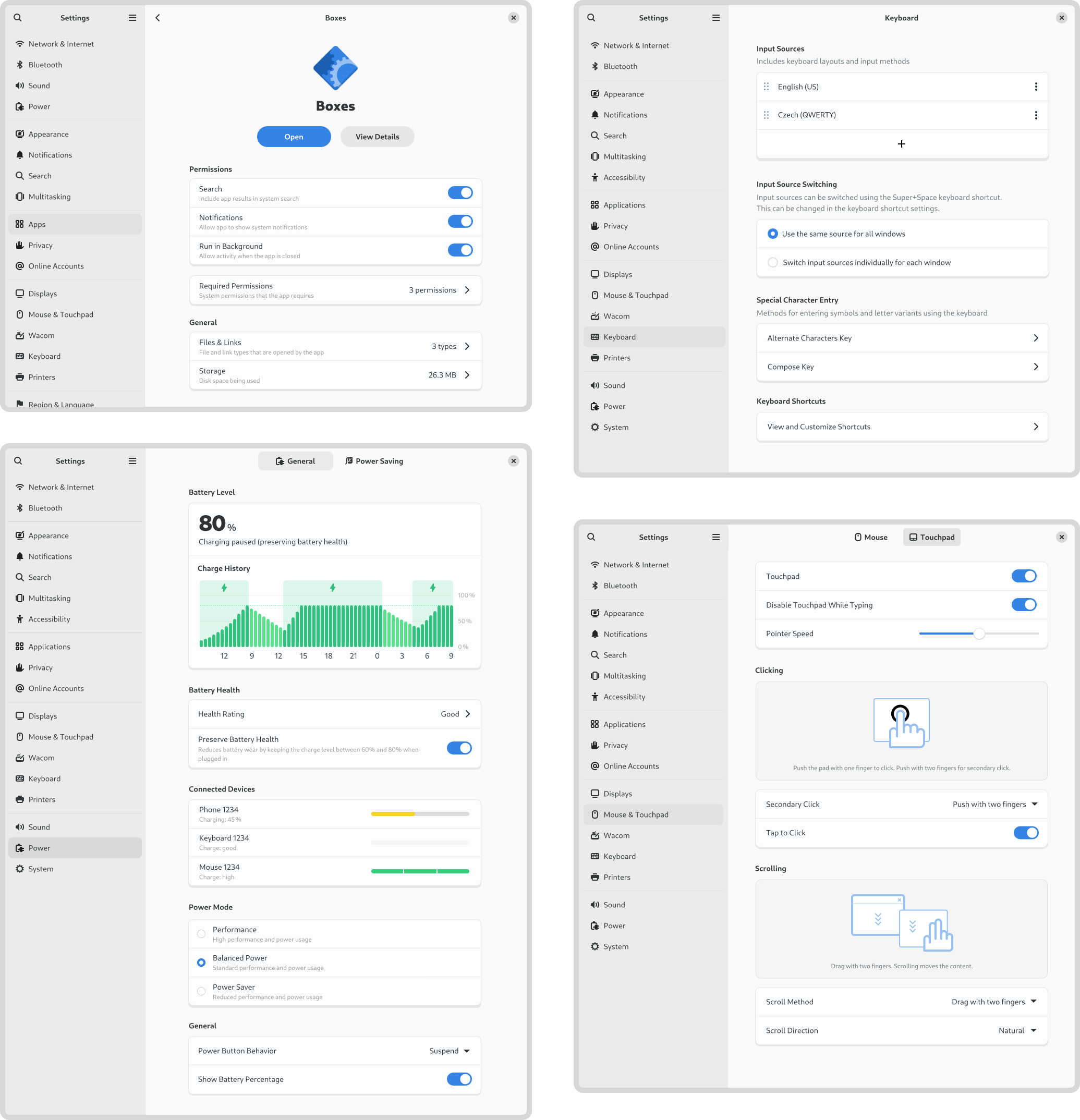
If my work on Videos and System Monitor has largely been speculative, my time on Settings has been anything but. As Felipe recently reported, there has been a lot of great activity around Settings recently, and I’ve been kept busy supporting that work from the design side. A lot of that has involved reviewing merge requests and responding to design questions from developers. However, I’ve also been active in developing and updating various settings designs. This has included:
- Keyboard settings:
- Region and language settings:
- Updated the panel mockups
- Modernised language dialog design (#202)
- Apps settings:
- Mouse & touchpad settings:
- New click areas setting (done)
- Updated designs for the test area (almost done)
- Power
Another settings area where I particularly concentrated this cycle was location services. This was prompted by a collection of issues that I discovered where people experience their location being determined incorrectly. I was also keen to ensure that location discovery is a good fit for devices that don’t have many ways to detect the location (say if it’s a desktop machine with no Wi-Fi).
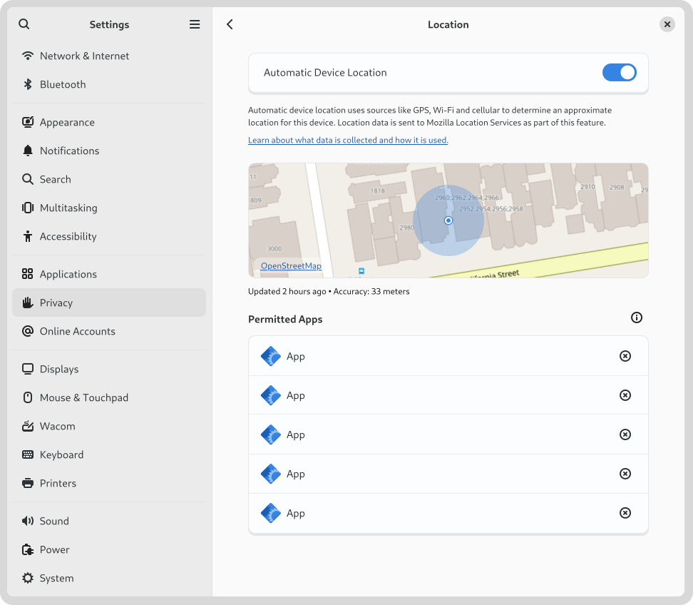
This led to a round of design which proposed various things, such as adding a location preview to the panel (#2815) and portal dialog (#115), and some other polish fixes (#2816, #2817). As part of these changes, we’re also moving to rename “Location Services” to “Automatic Device Location”. I’d be interested to hear if anyone has any opinions on that, one way or another.
Conclusion
I hope this post has provided some insight into the kind of work that happens in GNOME design. It needs to be stressed that many of the designs that I’ve shared here are not being actively worked on, and may even never be implemented. That is part of what we do in GNOME design – we chart potential directions which the community may or may not decide to travel down. However, if you would like to help make any of these designs a reality, get in touch – I’d love to talk to you!