
Our New Official Manjaro Website – Announcements
Hi Community,
after some extensive programming and testing including a lot of helpful forum feedback now the new manjaro.org is online!
I hope you enjoy this somewhat simplified, but also more professional, first contact point of Manjaro Linux.
For more information on the motivation and tech of this redesign, you can read the blog post about it:
Please let us know what’s you opinion of this certainly radical shift in design. For comparison you can find the former website for some time still at https://old.manjaro.org.
25 Likes
Very nice new design good job guys!
5 Likes
Looks very cool. However, on the
…this is confusing:
Hero
Core I7-13620H 10 Cores 16 Threads 4.90 GHz
15.6″ WQHD 2560*1440px 165 Hz Up To 64GB 5200MHz DDR5
Up To 2tb NVME GeForce RTX™ 4060 8GB
Those specs makes no sense to me. And I think there’s a typo with the venus’ sped:
Up To 1GB M.2 2280 PCIe4.0 SSD ×2
I think it’s meant to be 1TB, not GB.
1 Like
Looks awesome, @romangg. ![]() Refreshing and professional.
Refreshing and professional. ![]()
![]()
3 Likes
Love it, very good job!
I also like the fact that you don’t have to use such a dark mode. I really like this bright design.
1 Like
Thanks for proofreading. The specs has been copied over from the old website. But we lost some line breaks apparently:
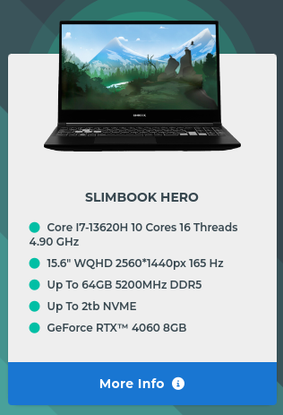
Does it make more sense this way?
1 Like
Ze Germans ar bek! Ze Germans ar bek!
Kvick, getten ze Spitfires up in ze air und aimen for ze blinkenlights on ze Messerschmitts! Droppen yor bomms on ze Bismarck! Vatschen out for ze Stukas! ![]()
Very clean design, nice work!
In my opinion the symbols for light and dark mode (sun and moon) should be swapped.
1 Like
You were faster than me again …
1 Like
See, zis is vy yoo shud not yoozen any translashun plugins in ihren browser. ![]()
3 Likes
Perhaps I am taking some risk by posting my critique. But, in my professional life I do value constructive criticism. So, here goes.
First, the general, at a glance look of the new website design is appealing. The spaciousness ensures it isn’t too busy, confusing, or off-putting. This also allows for additional information to be smartly added. So, at a glance it is nice.
That is about where the good vibe ends for me. If I were wanting a more detailed understanding of Manjaro, where do I go from there?
With this new, clean, and readable design, there is an abundance of real estate for short paragraphs, strategically placed links, and meaningful and relevant imagery. If I were still searching for a Linux distro, I wouldn’t find the information that I need from here. There aren’t any links that, with just one mouse click, would provide the details I need so that I may make an informed choice.
There is a goldmine of meaningful information that, well crafted, would help the uninformed and curious. As it stands, I don’t think that the current content of the website provides enough information.
8 Likes
I think this is good feedback. ![]()
@romangg, I would be willing to write up a few small paragraphs about Manjaro in collaboration with yourself and the other team members. ![]()
1 Like
Looks professional, I like it more than the old design ![]()
2 Likes
translate=“no”
Commands should be tagged with translation exclusions. wiki page.
and.
Official Images page.
Maybe it’s just me.
However, it would be nice if the date of the media was also listed. It’s always irritable.
1 Like
The Forum link to Downloads needs to be re-linked. ![]()
A nice simple 404 appears currently.
I presume this should be the URL:
https://manjaro.org/products/download/x86
This minimalistic mentality in web design has existed for some time; the approach is even taught to a great extent at colleges, universities, etc.
As a business site, the focus is on showcasing and sales; that’s the reality that a site such as this reflects.
However, I’ve seen much worse in the wild; we all have, haven’t we?. The Manjaro design at least has the potential to add more information; to grow with future needs.
The cards on the Download page might be better as links to (more detailed) pages for each Manjaro flavour; at the moment they only serve as download links; the cards could satisfy both.
On the Download page, images of older Manjaro versions are still being used. These might be useful (16/9 ratio; scale as needed):
Images removed…
- Manjaro-KDE-240702-desktop|690×388
- Manjaro-XFCE-240702-desktop|690×388
- Manjaro-Gnome-240702-desktop|690×388
- Manjaro-Gnome-240702-menu|690×388
- Manjaro-Cinnamon-240710-desktop|690×388
The images have served their intended purpose; now deleted, to lessen any possible burden on server.
Cheers.
While interesting, the design, content, and purpose of a website should be for the benefit of those visiting, not adherence to a particular design philosophy.
That depends. The company I work for provides information exploring the capabilities and services that they offer. This is accomplished with what you referred to as a minimalistic design, but that still provides information that is well organized and accessible from the home page.
Yes, that is the point I was driving. The look and feel are good, the approach of not bombarding visitors with TMI right away, I think is good. I chose not to comment at all about any specific design elements, rather just the information void.
1 Like
While I agree, in essence, any commercial site not only has to benefit those visiting, but must also be effective in producing sales.
However, there was no suggestion of adhering to any particular design philosophy; but simply to say this minimalistic approach exists, and is well embedded as a defacto standard in web design teaching programs.
It’s nice when a site delivers content in a well presented, practical manner, with minimal information to attract some initial interest, and then more in depth information only a click-or-two away…
Too often, that desired information doesn’t exist.
Perhaps a More information or Read more invitation leads to a Sign-in page, or a vaguely relevant promotion; but not the information wanted. I recall seeing some sites with skeleton descriptions actually repeated, and paraphrased; several times; evidently to bolster content.
Some sites are thankfully better than others in this regard, though I maintain information should be both available and accessible, with a minimum of interaction.
I’m sure most would agree that’s a reasonable expectation.
Cheers.
2 Likes