One Week With KDE Plasma Workspaces 6 on Fedora 40 Beta (Vol. 1) – Stephen Gallagher’s Open-Source Blog
Why am I doing this?
As my readers may be aware, I have been a member of the Fedora Engineering Steering Committee (FESCo) for over a decade. One of the primary responsibilities of this nine-person body is to review the Fedora Change Proposals submitted by contributors and provide feedback as well as being the final authority as to whether those Changes will go forth. I take this responsibility very seriously, so when this week the Fedora KDE community brought forth a Change Proposal to replace GNOME Desktop with KDE Plasma Workspaces as the official desktop environment in the Fedora Workstation Edition, I decided that I would be remiss in my duties if I didn’t spend some serious time considering the decision.
As long-time readers of this blog may recall, I was a user of the KDE desktop environment for many years, right up until KDE 4.0 arrived. At that time, (partly because I had recently become employed by Red Hat), I opted to switch to GNOME 2. I’ve subsequently continued to stay with GNOME, even through some of its rougher years, partly through inertia and partly out of a self-imposed responsibility to always be running the Fedora/Red Hat premier offering so that I could help catch and fix issues before they got into users’ and customers’ hands. Among other things, this led to my (fairly well-received) series of blog posts on GNOME 3 Classic. As it has now been over ten years and twenty(!) Fedora releases, I felt like it was time to give KDE Plasma Workspaces another chance with the release of the highly-awaited version 6.0.
How will I do this?
I’ve committed to spending at least a week using KDE Plasma Workspaces 6 as my sole working environment. This afternoon, I downloaded the latest Fedora Kinoite installer image and wrote it to a USB drive.1 I pulled out a ThinkPad I had lying around and went ahead with the install process. I’ll describe my setup process a bit below, but (spoiler alert) it went smoothly and I am typing up this blog entry from within KDE Plasma.
What does my setup look like?
I’m working from a Red Hat-issued ThinkPad T490s, a four-core Intel “Whiskey Lake” x86_64 system with 32 GiB of RAM and embedded Intel UHD 620 graphics. Not a powerhouse by any means, but only about three or four years old. I’ve wiped the system completely and done a fresh install rather than install the KDE packages by hand onto my usual Fedora Workstation system. This is partly to ensure that I get a pristine environment for this experimen and partly so I don’t worry about breaking my existing system.
Thoughts on the install process
I have very little to say about the install process. It was functionally identical to installing Fedora Silverblue, with the minimalist Anaconda environment providing me some basic choices around storage (I just wiped the disk and told it to repartition it however it recommends) and networking (I picked a pithy hostname: kuriosity). That done, I hit the “install” button, rebooted and here we are.
First login
Upon logging in, I was met with the KDE Welcome Center (Hi Konqi!), which I opted to proceed through very thoroughly, hoping that it would provide me enough information to get moving ahead. I have a few nitpicks here:
First, the second page of the Welcome Center (the first with content beyond “this is KDE and Fedora”) was very sparse, saying basically “KDE is simple and usable out of the box!” and then using up MOST of its available screen real estate with a giant button directing users to the Settings app. I am not sure what the goal is here: it’s not super-obvious that it is a button, but if you click on it, you launch an app that is about as far from “welcoming” as you can get (more on that later). I think it might be better to just have a little video or image here that just points at the settings app on the taskbar rather than providing an immediate launcher. It both disrupts the “Welcome” workflow and can make less-technical users feel like they may be in over their heads.
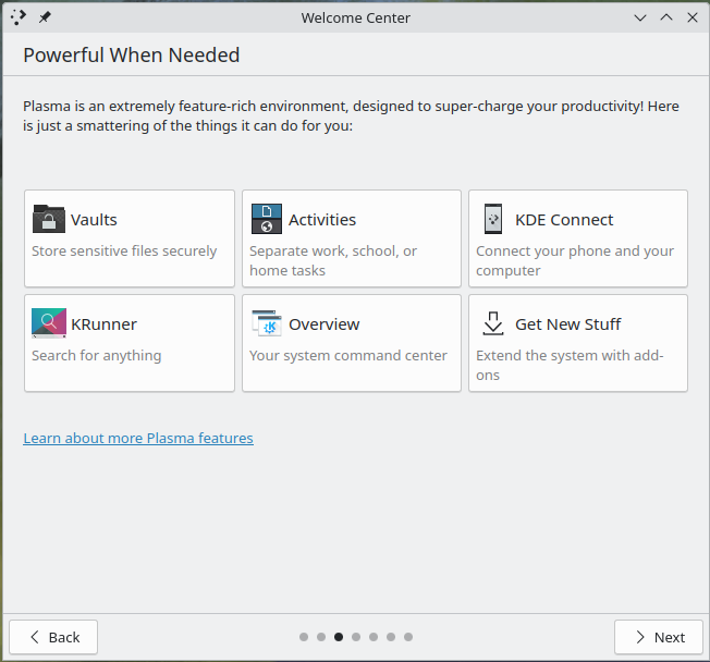
I actually think the next page is a much better difficulty ramp; it presents some advanced topics that they might be interested in, but it doesn’t look quite as demanding of them and it doesn’t completely take the user out of the workflow.

Next up on the Welcome Center was something very welcome: an introduction to Discover (the “app store”). I very much like this (and other desktop environments could absolutely learn from it). It immediately provides the user with an opportunity to install some very popular add-ons.2

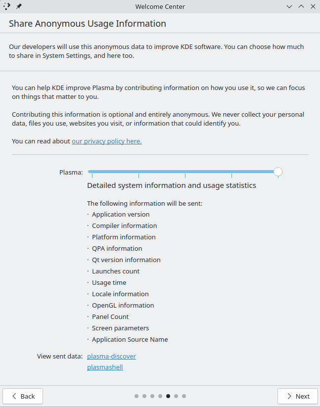
The next page was a bit of a mixed bag for me. I like that the user is given the option to opt-in to sharing anonymous user information, but I feel like the slider and the associated details it provided are probably a bit too much for most users to reasonably parse. I think this can probably be simplified to make it more approachable (or at least bury the extra details behind a button; I had to extend the window from its default size to get a screenshot).

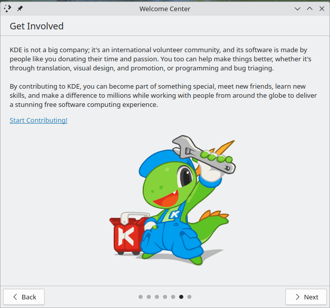
At the end of the Welcome Center was a page that gave me pause: a request for donations to the KDE project. I’m not sure this is a great place for it, since the user hasn’t even spent any time with the environment at all yet. It seems a bit too forwards with asking for donations. I’m not sure where a better place is, but getting begged for spare change minutes after installing the OS doesn’t feel right. I think that if we were to make KDE the flagship desktop behind Fedora Workstation, this would absolutely have to come out. I think it gives a bad first impression. I think a far better place to leave things would be the preceding page:

OK, so let’s use it a bit!
With that out of the way, I proceeded to do a bit of setup for personal preferences. I installed my preferred shell (zsh) and some assorted CLI customizations for the shell, vi, git, etc. This was identical to the process I would have followed for Silverblue/GNOME, so I won’t go into any details here. I also have a preference for touchpad scrolling to move the page (like I’m swiping a touch-screen), so I set that as well. I was confused for a bit as it seemed that wasn’t having an effect, but I realized I had missed that “touchpad” was a separate settings page from “mouse” and had flipped the switch on the wrong devices. Whoops!
In the process of setting things up to my liking, I did notice one more potential hurdle for newcomers: the default keyboard shortcuts for working with desktop workspaces are different from GNOME, MacOS and Windows 11. No matter which major competitor you are coming from, this will cause muscle-memory stumbles. It’s not that any one approach is better than another, but the fact that they are all completely different makes me sigh and forces me to think about how I’m interacting with the system instead of what I want to do with it. Unfortunately, KDE did not make figuring this out easy on me; even when I used the excellent desktop search feature to find the keyboard shortcut settings, I was presented by a list of applications that did not clearly identify which one might contain the system-wide shortcuts. By virtue of past experience with KDE, I was able to surmise that the KWin application was the most likely place, but the settings app really didn’t seem to want to help me figure that out. Then, when I selected KWin, I was presented with dozens of pages of potential shortcuts, many of which were named similarly to the ones I wanted to identify. This was simply too many options with no clear way to sort them. I ended up resorting to trying random combinations of ctrl, alt, meta and shift with arrow keys until I eventually stumbled upon the correct set.
Next, I played around a bit with Discover, installing a pending firmware update for my laptop (which hadn’t been turned on in months). I also enabled Flathub and installed Visual Studio Code to see how well Flatpak integration works and also for an app that I know doesn’t natively use Wayland. That was how I discovered that my system had defaulted to a 125% fractional scaling setup. In Visual Studio Code, everything looked very slightly “off” compared to the rest of the system. Not in any way I could easily put my finger to, until I remembered how badly fractional scaling behaved on my GNOME system. I looked into the display settings and, sure enough, I wasn’t at an integer scaling value. Out of curiosity, I played around with the toggle for whether to have X11 apps scale themselves or for the system to do it and found that the default “Apply scaling themselves” was FAR better looking in Visual Studio Code. At the end of the day, however, I decided that I preferred the smaller text and larger available working area afforded me by setting the scaling back to 100%. That said, if my eyesight was poorer or I needed to sit further away from the screen, I can definitely see the advantages to the fractional scaling and I was very impressed by how sharp it managed to be. Full marks on that one!
I next went to play around in Visual Studio Code with one of my projects, but when I tried to git clone it, I hit an issue where it refused my SSH key. Digging in, I realized that KDE does not automatically check for keys in the default user location (~/.ssh) and prompt for their passphrases. I went ahead and used ssh-add to manually import them into the SSH keyring and moved along. I find myself going back and forth on this; on the one hand, there’s a definite security tradeoff inherent in allowing the desktop to prompt (and offer to save) the passphrase in the desktop keyring (encrypted by your login password). I decline to save mine persistently, preferring to enter it each time. However, there’s a usability tradeoff to not automatically at least launching an askpass prompt. In any case, it’s not really an issue for me to make this part of my usual toolbox entry process, but I’m a technical user. Newbies might be a bit confused if they’re coming from another environment.
I then went through the motions of getting myself signed in to the various messaging services that I use on a daily basis, including Fedora’s Matrix. Once signed in there via Firefox, I was prompted to enable notifications, which I did. I then discovered the first truly sublime moment I’ve had with Plasma Workspaces: the ephemeral notifications provided by the desktop. The way they present themselves, off to the side and with a vibrant preview window and show you a progress countdown until they vanish is just *chef’s kiss*. If I take nothing else away from this experience, it’s that it is possible for desktop notifications to be beautiful. Other desktops need to take note here.
I think this is where I’m going to leave things for today, so I’ll end with a short summary: As a desktop environment, it seems to do just about everything I need it to do. It’s customizable to the point of fault: it’s got so many knobs to twist that it desperately needs a map (or perhaps a beginner vs. expert view of the settings app). Also, the desktop notifications are like a glass of icy lemonade after two days lost in the desert.
