Introducing SUSE Typeface: SUSE’s new open sourced font
Ivo Totev and Spencer Davis
Creating a typeface is a delicate process. Each character (or glyph) embeds new attributes into the whole. Designed to be seen again and again without fatigue.
A brand’s font family represents its voice beyond the logo, projecting personality in every encounter of the written word.
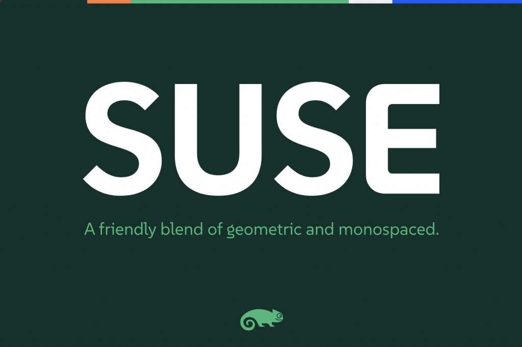
Today we are excited to announce the release of the official SUSE typeface, appropriately named “SUSE”. The SUSE font family supports over 200 Latin-based languages.
Now, we look more SUSE than ever.
Releasing our official font family as open source is the obvious choice for SUSE, so that’s exactly what we’ve done.
SUSE is now available to try via Google Fonts
The project sources can be explored on the SUSE GitHub repository
SUSE Linux Enterprise customers can install it directly via the suse-fonts package
Let’s take a look at some details:
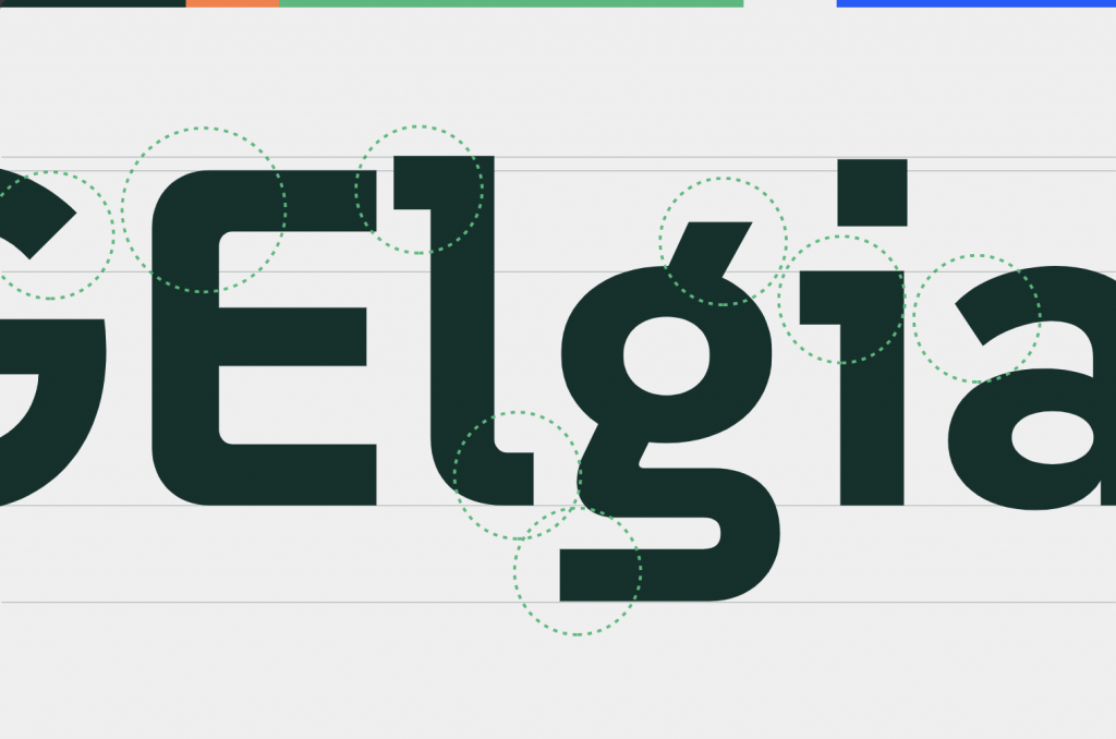
‘SUSE’ is a sans serif typeface designed by René Bieder in partnership with SUSE employees, embodying a unique hybrid between geometric and monospaced features. It captures the essence of our company, ethos, and open-source solutions.
This versatile typeface includes the following variants: Thin, ExtraLight, Light, Regular, Medium, SemiBold, Bold, and ExtraBold.

The ‘SUSE’ font was created to connote our innovative, & open-source spirit, delivered through a reliable and purposeful experience.
It provides clarity and legibility, making this typeface ideal for digital assets and print.
The geometric and console-inspired style, evokes our technical nature reflected in a modern and efficient aesthetic.

SUSE stands out with a variety of weights – allowing consistency, flexibility, and harmony through headlines, to body text, to application interfaces.

We hope you like it as much as we do.
(Visited 1 times, 1 visits today)
